Entering the new Institute of Contemporary Art at its morning-to-night public debut on December tenth, which more than 7,500 people attended, felt like an accidental work of process art consecrating the grand opening. After waiting an hour or more to collect your Wonka-esque Pink Ticket and burning some time sipping hot chocolate or coffee in the entertainment tent (courtesy of Target, of course), chances are you waited at least another hour or two before setting foot inside the museum. Thankfully, your efforts were immediately rewarded by Chiho Aoshima’s beautiful mural The Divine Gas, a fantastically detailed surrealistic dreamscape modeled after the visual style and conventions of Japanese animation. (It is also conveniently poised to distract you from realizing that you were now, in fact, waiting in another line to access the gallery spaces.)
The enthusiastic public response and general clamor surrounding the opening stirred up a sense of cultural relevance that the museum directors desperately want implanted alongside their identity in Boston’s public consciousness. With the current media attention lavished on the institution, this is not an unreasonable goal, but the keys to the museum’s enduring success will lie in its gallery spaces, and without fanfare.
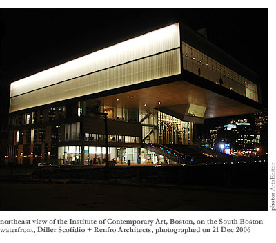
A great deal of attention has been directed towards the museum’s architecture, and appropriately so. The role of a museum is unique among public edifices—it functions not only as an autonomous work of art but also as a framing structure for the presentation and interpretation of other works. Here, the new ICA succeeds sweepingly.
As an independent piece, the ICA is strikingly thoughtful and innovative. The improbably overhanging mass of the gallery floor captures the visitor’s imagination from a distance, and up close the details keep the eyes moving and interested. An appropriately postmodern ethos dominates the physical museum, forging a singular identity from unrelated parts through their presentation.
The overall structure is a composition that melds the strong, hard lines that define the building’s exoskeleton and the sharply geometric figures of the staircases, promenades, and bleachers that jut forth from the central structure with the softened sensibility of rounded corners curbing the rear sections, matte metals, and translucent glass. A pervasive material unity binds the perceptibly and intentionally disjointed building together by exploiting visual dialectics of soft-and-hard, transparent-and-translucent, metal-and-wood, modern-and-historical.
A lot of indulgent criticism has been wasted on the relationship between the building and the harbor, likening its imagery to a lighthouse, its material palette to traditional shipyards, and making a great big deal about the museum being built on a pier. These people are missing the point.
Yes, the South-American Santa Maria wood creeping throughout the museum’s interior and exterior surfaces has a maritime history and aesthetic that designers knew about when selecting the material. No, you shouldn’t care about this—by assigning a narrative or storied identity to an institution whose social role centers about change and innovative art practice, you undermine its plural essence. I’m not sure if this is an attempt to increase the museum’s local cultural capital, validate its choice of locale in South Boston, or give visitors some easily explainable bit of semiotics to feel good about.
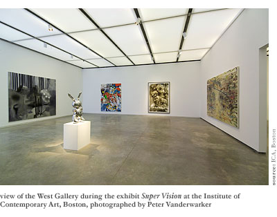
On the inside, the ICA remains triumphant. The same material cohesion operates small-scale throughout the gallery spaces, juxtaposing concrete, glass, and wood seamlessly and preserving the building’s powerful identity. Attention to detail is spectacular, and small touches like decorative wooden paneling inside the elevator shaft catch your imagination at every turn. The Great Glass Elevator (a 50-person lift that moves through the center of the building, offering views of several open spaces en route to the top) and the narrow, spiraling staircases give the visitor a sense of the museum’s vertical structure that is exciting to experience, offering a top-down perspective on the museum’s interiority.
The exhibited works respond to the gallery spaces with overwhelmingly positive energy. One of the great faults of New York’s new Museum of Modern Art—arguably the ICA’s biggest competition for contemporary art world relevance—is that its gallery spaces are unnaturally large, dwarfing enormous works and overshadowing their presence with the museum’s own looming, albeit moving, spaces. The designers of the ICA seemed keenly aware of the hung works and installations that would inhabit their museum, creating a diverse array of intimate, exciting spaces.
The museum’s greatest fault is also its most obvious shortcoming: it’s painfully, and perhaps tragically, small. Offering only 17,000 square feet of gallery space, the ICA is dwarfed by all of the other major collecting museums in America. (The aforementioned MoMA features a sprawling 125,000 square feet over on West 53rd in Manhattan.) While this limitation won’t necessarily prevent the museum from attaining a status of commanding relevance among contemporary art venues, it will keep the museum from ever rising to the level of other modern art powerhouses and, more importantly, providing visitors with an extended context for the works they are experiencing.
When you visit the MoMA, you pass through two floors—each bigger than the whole of the ICA’s gallery spaces—filled with modern art and sculpture that spans every major artist and movement from Impressionism to Pop Art and beyond, providing an accessible image of the dialectics that have led to whatever most recent works occupy the museum’s temporary galleries. This will never be the ICA, and curators must recognize the uniqueness of the forward-thinking niche their museum must occupy if it is to succeed.
Visitors enter through the West Gallery, home to the temporary exhibition space and the current exhibition Super Vision, on view through April 29, 2007. While interesting and at times compelling, the organization of this exhibition is unfortunately unoriginal and fails to occupy any sort of new curatorial or meaningful space.
The best works in Super Vision are stellar and explore, as promised, new ways of seeing art and the world. Josiah McElheny’s Czech Modernism Mirrored and Reflected Infinitely makes clever use of one-way glass and a mirror box to create illusionistic space in which the ostensibly real decanters (also made from reflective silver) are reproduced as far as the boundaries of vision can intimate their existence. Along with Ugo Rondinone’s 11.Mai.2006, a set of two large discs that induces optical mini-seizures as the eye approaches and withdraws, the work makes a satisfactory assault on the ways in which we validate our reality through perception, and how that perception is malleable.
Several fantastic works of photorealism depict a contrastingly hard-line image of perception. Jeff Wall’s Concrete Ball (2002) captures a rainy-day portrait of Vancouver as a transparency mounted on a lightbox, presenting the scrupulous details of man-made objects like the central orb and the surrounding naturalistic imagery of soggy grass and leaves all within an advertising scheme. Noriko Furunishi’s Untitled (Grey Dry Stream) (2005) is an all-over photography effort that uses digital processing to render every stone and granule of the riverbed in super-visual resolution. The viewer’s eyes flow unceasingly up and down the abandoned path, finding infinite variation in its detail and coloration that presents the photograph as a Zen meditation on natural artfulness and a formal composition of elemental magnificence.
Altogether, the exhibition would be unobjectionable if more works like these stood together, offering visitors a scatterplot of new developments in optical art that have arisen from new technology and thinking about visual culture. The potential to achieve such a solvent characterization, however, is unfortunately compromised by a number of older optical works.
Works as diverse (and temporally scattered) as Bridget Riley’s Pause (1964), Jack Goldstein’s Untitled (1983), Harold Edgerton’s Shooting the Apple (1964), and a slew of early-’90s pieces populate the exhibition, slaughtering any genuine attempt to depict contemporary art. None of these works lacks in quality whatsoever—Yoko Ono’s Sky TV is as interesting today as it was in 1966 (though it is somewhat less provocative and insightful to the new viewer); they are only problematic because, as elements of an exhibition of contemporary artworks, they turn attention away from the future of an artistic movement.
A pairing of Jeff Koons’ works best focuses the exhibition’s internal disconnect. The (fantastic) Pop-op collage Olive Oyl, painted in 2003, appears alongside his (also fantastic, if dated and suspiciously infamous) 1986 sculpture Rabbit. This is an Op Arts retrospective masquerading as a forecast of forthcoming directions for new, optically oriented works. At the MoMA or even across town at Boston’s Museum of Fine Arts this would be a reasonable undertaking, but here the curators seem misguided about the potential of their museum’s resources and cultural foothold. Art-historical curating has no place here; art-futuristic inspiration will let this thoroughly unique museum shape tomorrow’s art histories.
One true virtue of the ICA highlighted by Super Vision is the wealth of small gallery spaces hidden in corners throughout the main space. These rooms are ideal for video, environmental, installation, and single-artist displays and can immerse visitors in intimate spaces where they can explore without feeling overwhelmed or lost.
Mona Hatoum’s 1994 installation Corps étranger (Foreign Body), transported from the Centre Pompidou modern art mecca in Paris, is another stellar work that lives in such a space-within-a-space—a video loop of corporeal close-ups (often internal shots of the nose, throat, etc.) is shown on the floor of a tight cylindrical space barely big enough to accommodate a body without stepping on the art. Not only does the footage offer a shining example of new vision, turning the Lacanian self-image inside-out by presenting the individual in dialogue with its own composite parts, but the space catapults the work into the realm of brilliance, trapping the already uncomfortable viewers in a cavity that literally plunges them into the artist’s body.
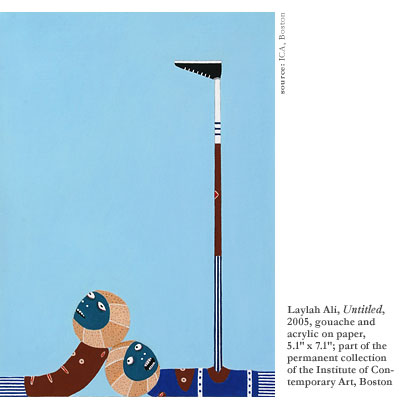
Despite being basically antithetical to the museum’s mission to provide a home for contemporary art, the ICA’s permanent collection contains a number of gem works that inspire new hope for the museum’s still uncomfortably cloudy future. Laylah Ali’s violent and sinister gouache works depict the aftermath of a series of unknown (though unquestionably negative) goings-on in the world of her signature characters, the Greenheads. They are at once charming and haunting, drawing the viewer into an ambiguous narrative space where what happened is less important than the emotional impact—or lack thereof—imparted unto the viewer. Their dimensions are small and their colors eccentric, invoking the conventions of comic book cartoonishness, while their imagery contrasts gothic figuration with the familiar language of surrealism. Above all, the drawings are bravely representational, minimalist, and identifiable, forging a new course for the oft-overlooked niche of a contemporary pictorial artist.
One of the surviving relics of the ICA’s Back Bay home, Hanging Fire (Suspected Arson) is a relatively recent (1999) work by British artist Cornelia Parker that offers a visually and critically satisfying cornerstone for the collection. Despite its origins in the charred remains of an alleged arson incident, the suspended sculpture succeeds primarily in its visual/spatial dynamic. The three-dimensional work can be observed from all sides, and plays gently with geometry. The mauled shards imply a transparent rectangular frame (echoed by the metal grid from which they are suspended). The binding fishing line is visible and organizes the work into vertical columns, which the individual elements resist as their incongruous shapes lean inward or jut outward, creating a chaotic, membranous shape that breathes as the strands rotate and insist upon their own ephemeral essence. Paradoxically, Parker mentioned in an interview that she always reassembles the work in its gallery residence to allow the space some agency in controlling the work’s structure, yet she uses a numbered diagram to preserve the continuity of each recreation.
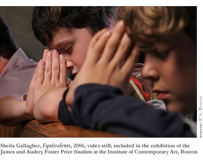
The four contenders for the ICA’s biennial James and Audrey Foster Prize—shown in the anterior rooms of the permanent collection wing through March 11, 2007—are by far the most exciting works here. The spirit that they exude and the exemplary judgment exercised by the exhibition curators and subordinate juries are a central pillar of hope for the ICA.
Rachel Perry Welty and Sheila Gallagher stand a head above their competition. Three of Welty’s four installed pieces are breathtaking—two beautiful, wall-filling sculptures made from assorted twist-ties and an inverted food pyramid comprised of miniature models of food packaging (i.e. at the grain level there are boxes of Wheaties; at the sugars and fats level packages of Crisco and corn syrup). Beyond their arresting scope and color palette, the works are invested in a serious interrogation of American consumerism and explore a related sense of new materialism (like twist-ties) that makes the works tangibly accessible to viewers.
Cumulonimbus, Gallagher’s most breathtaking work, literally lives on the other side of Welty’s Two Page Spread wall. The piece is a collage of living flowers—water by a hydroponics system built into the gallery wall—that makes the perceived canvas literally breathe and grow. Its palette is beautiful and the floral selection is unquestionably tasteful, but the work is most interesting as it plays between its two-dimensional presentation as a painting and three-dimensional depth as sculpture. Feeling (and smelling) like a Jackson Pollock that you could strut right into, Cumulonimbus mystifies, and the viewer leaves with an ambiguous complex of interpretations that never tarnishes its simple beauty.
Two other Gallagher works—Unknown title: After Church I and II—contrast nicely with the flower mosaic as ultra-flat, large-scale paintings in smoke and soot, depicting barely-figured landscapes outlined only as negative-space images that blend right into the raw canvas. They are perhaps the most accomplished pieces working within the language of traditional painting found outside the permanent collection, and present a hopeful new sensibility for painting that recalls Cecily Brown.
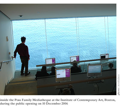
Lying at the very center of the overhung gallery space, the celebrated Poss Family Mediatheque is the most unique and perhaps compelling element of the new ICA. From the entryway, the theatre-nouveau looks down on the rippling harbor, framing an exclusive vision of the water that simultaneously evokes the languages of painting, film, and photography. Aside from this breathtaking view, the mediatheque is named for the roughly two-dozen iMac computer stations on tiered benches that line the sloping theatre. Each has access to an impressive library of video and textual information, including interviews with artists, samples of other works, and interactive features that allow visitors to comment on pieces and each other’s commentary. If the ICA indeed must provide a compelling context within its limited space, as well as an opportunity for relevant and unique artistic experiences, perhaps the answer lies here.
In the days since its gala opening, the resurrected ICA is being held to the art world’s most scrupulous criticism and shows only the faintest signs of buckling. The exhibitions are at times problematic, yet more often hopeful. For now, it feels less important that these exhibits succeed in any particular fashion than the museum show a flexibility and candor that embraces the ever-changing spirit of contemporary art and truly grows with the artwork it houses. With a 70-year history behind it, Boston’s Institute of Contemporary Art finally has the spatial and financial means to achieve relevance and meaningfully affect the art community, and I believe the museum will grow to perform beyond all expectations.
