Encountering an exhibit of works by two artists in one small gallery, anyone—scrutinizing critic, casual connoisseur, interior designer, or hubby held hostage by aesthete wife—will tend to look for points of comparison and contrast between the artists, rightfully suspecting that the curator has chosen to pair them for a reason. For what it’s worth, any of those legitimate subsets of visitors to the current pair of exhibits at Gallery NAGA will find almost exclusively points of contrast rather than comparison—and stark ones at that.
From June 4th through July 30th, the NAGA, located for 27 years on Newbury Street, is exhibiting Masako Kamiya: On Paper and Allan Rohan Crite: Selected Works 1934-1998. Just about the only thing these two artists have in common, on first impression, is their residence in Boston, but almost any two artists who’d exhibit at NAGA have that in common anyway, because, as curator and gallery director Arthur Dion corroborates, only the humble furniture-makers who show their work there come from other places. Kamiya, a young artist from Japan who has studied in recent years at the Montserrat College of Art and Massachusetts College of Art, makes what might loosely be called methodically pointillist abstractions that resonate primarily in the world of spiritual connotation. Crite, a 94 year-old African-American man who has lived in Boston since 1911 or so (and who has been showing his work publicly since the ’30s), draws, watercolors, and prints representational images that thrive on social context and historical association, even when treating clerical matters.
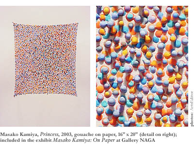
Masako Kamiya’s ten tight-and-bright pieces, less sequence or series than set of strophes, clearly come from a single source and probably from a single burst of inspiration. Each work consists of hundreds of dots roughly the size of a pinhead (and possibly just as danced upon by angels) that she has applied with a slender brush on a large fresh sheet of fine French paper (usually 16″ x 20″, sometimes 22″ x 30″) whose watermark remains legible in a corner of the framed page. Some of the clustered but unquestionably discrete dots remain flat on the clean paper, just round stains really, while some, thanks to Kamiya’s repeated application of dots after each round of applications has dried, rise a few millimeters from the sheet. Such painstaking stippling has to be among the Zennest activities imaginable, because the prolonged concentration would surely remove all distraction from the mind—but it must also drive the artist nuts.
Kamiya has limited each piece to a palette of two, three, or four colors—mustard yellow, plum, sky blue, and magenta, for example—and has let all but one cumulative cluster of integrated colors assume a generally rectangular, portrait-style shape in the exact center of the sheet, leaving lots of white space for the form to breathe. Scent, the radical departure from this rectangular rule, consists of an oval red shape with an almost pulsating center of densely clustered black dots—evocative of a garden flower. The milder exceptions include the two or three rectangles with concave sides, such as Princess—a gathering of light blue, violet, and orange dots that suggests the sticky-sweet pubescent fruitiness of adolescence.
None of the ten symmetrical images even thinks about venturing toward the vast white frontier at the edge of the paper. They’re all doing fine right where they are, as at peace with themselves as a group of Buddhist monks in a Zen monastery in Kyoto, with nowhere special to go but content to sit quietly, yet stunningly, with their own distinct character that has been created by nature or nurture or both.
They seem all the more content, in fact, to have precise, clean, evocative names that describe their mysterious characters. A summery arrangement of yellow and light green dots, Dill Field, stands there in the midst of the page, no wind to wave it, an even distribution of sun lighting it. Later in the season, October displays a field of broken green plant cells—chlorophyll cracked open by the jaws of the cold air and gone all russet, iron, and ochre—the dill field after the first hard frost. Breath, dense and tense at the center with a thick cluster of red, blue, and yellow dots, goes completely yellow with exhaled relief toward the edges, camouflaging within its concave sides a grid of curved lines more discernible from afar than near. Similarly, the red, blue, and teal dots of Earth contain in their rectangular structure the longitudinal marks of a globe, as if an alien geographer had made out the shape of our wondrous planet at night through a kaleidoscopic comet shower. The Polestar, too, makes shapes with its yellows, purples, blues, and magentas—radiant enough, if not clearly (to the non-astronomer anyway) referring to the northern star at the end of the Little Dipper.
On Allan Rohan Crite’s side of the gallery, it’s a whole other story, decidedly more earthy than celestial. These dozen Crites, including four brush-and-ink renderings of Christian religious scenes and services (all of them from the 1930s) and eight drawings, watercolors, and prints of public Boston street scenes (two from the ’40s, a few from the ’70s, and a couple from the ’90s), cluster around their broad, populist theme the way Kamiya’s dots do around the center of a sheet of paper. But the four liturgical scenes, drawn from the Episcopalian faith Crite is known to have inherited from his mother, don’t form a complete spectrum of the doctrine or the practice, and the eight street scenes could not all fit together, end-to-end, in a geographical jigsaw puzzle of the South End and Roxbury neighborhoods he has represented over the years.
 To some degree, the large brush-and-ink illustrations of black Episcopal life tend to overwhelm Crite’s side of the gallery, consuming with their sizeable proportions a third of his half of the room while being arguably more than a third less interesting than his street scenes. As presented, they seem more important to the artist’s entire body of work than they might actually be—and their reverent depiction of high pomp and sacred ritual contrast starkly with the relaxed portrayal of ordinary life in the neighborhood seen in his other creations. In The Annunciation to Mary and The Annunciation to the Shepherds by the Heavenly Choir and Mass of the Nativity of Our Lord, angels and figures from the holy family stand ceremoniously in the midst of key Christian moments, all decked out in the elaborately embroidered robes of the high Anglican service that was imported from England. The fact that the angels and holy family have dark faces is all there is to distinguish the pictures from conventional illustration. No strident or soulful social commentary informs the pictures. Just a straight-faced, even strait-laced, representation of reverence—completely removed from the more commonly known images of southern black Baptists in flowery hats and colorful Sunday-best clothes singing and praising and speaking in tongues.
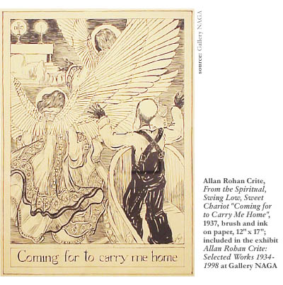
Still, one of the religious pictures does explore the more familiar black American experience that Crite, a legend in Boston as a sort of resident Romare Bearden or Jacob Lawrence, has reliably explored over the years. Labeled From the Spiritual, Swing Low, Sweet Chariot, “Coming for to Carry Me Home,” this drawing comes, according to Arthur Dion again, from one of two illustrated songbooks Crite produced with Harvard University Press. In the scene, the bald, bearded, black sharecropper in overalls stands, a band of angels by his side, in a heaven-bound chariot with his back to the room, opening his arms to receive the blessing of the altar he sees among the clouds. Here the admirable tradition of sacred African-American music gets its due, and the appetite gets stimulated for more from this series—two or three at least, if not a whole exhibit of the illustrations he did for those books.
On the other walls of the gallery, the celebration of African-American experience continues in the streets outside of the church. Allan Rohan Crite has long been admired for documenting in two dimensions the sorrow and joy of ordinary daily life in Boston’s South End and Roxbury neighborhoods. His appetite for local color—and for local people of color—has led him to do harmless and wholesome studies of this street life that have a folk-art innocence and a tender and affectionate spirit of humanity. In these pictures, the neighborhoods do not appear to be the Soweto-like areas they’ve been known to be. In Dudley and Codman Squares, life goes on without apparent incident most of the time after all, with all manifestations of pathological social alienation happening in private or only sporadically—gangs fighting over turf, wayward young fathers getting busted and hauled off to prison, single mothers struggling to support their children fed on minimum wage welfare-to-work jobs. Where an overtly political artist might strive to capture these scenes of crisis, to his credit Crite has chosen to describe the moments between, when community life rolls placidly along.
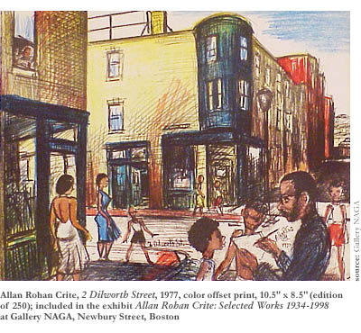
Interestingly, these pictures come in pairs, and each pair whets the appetite for the whole series it comes from, a good example being 2 Dilworth Street and 410 Columbus Avenue, both done in 1977. In the former, he depicts his own much younger self busy with sketchpad at a summertime street corner where a shapely black woman in a white dress and a doting mother with her child give scale and definition to the burnished-green copper turrets above the entrance of a corner store. In the latter, Crite shows himself at work on a drawing of a mother and a child (his indefatigable emphasis on wholesomeness and health again), only now he’s the familiar older public man seen in print-media profiles over the years, his white moustache, owlish glasses, and dark suit (with nice teal tie) giving good backdrop to a soft-looking wall of those atmospheric red-brick South End apartment buildings.
It’s great to see the unthreatening, calmly accepting view of a black American social life so readily portrayed elsewhere as disorganized and hopeless, and nice to know African-Americans are actually allowed to live in comfort. Yet it’s also good to see, in the remaining pair of pictures from Crite’s side of the Gallery NAGA exhibit, that he has not portrayed everything as pleasant.
Endangered Species, a 1998 etching of three young, harmless-looking black boys, tells us with its title that there’s trouble all around. Even though these youths, a taller older brother facing two younger boys, do not seem to be up to no good, the assumption is that trouble will find them soon—and if the incarceration rates of African-American men are any indication, it’s not unlikely that it will.
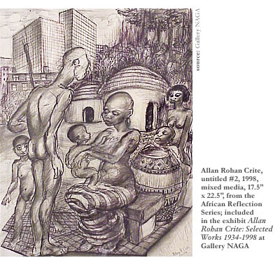
Untitled #2, a 1998 mixed-media piece from Crite’s African Reflection Series, makes its statement with a surprising juxtaposition of images. An extended family of West African villagers in simple native dress—i.e. mostly just naked—go about their daily lives in front of their two neatly constructed grass huts. There’s a large, artfully woven reed basket among them—symbol of bounty, since it probably contains grain—and everything looks fine, as if the European slave traders haven’t yet shown up with their firearms and shackles (or maybe did already but overlooked this village). But over the African baobab treetops rise the familiar rooftops of the red brick, four- and five-story urban American tenements again—a stark metaphorical use of images that questions the assumed improvements that the Western industriopolis made over the “undeveloped” back-country worlds it has assimilated. The contrast is made all the more strange by the more distant backdrop of glass corporate towers beyond the brick tenements. It could well be the view an even vaguely nostalgic African-American with a longing for a homeland he’s never necessarily seen would take of the Copley Square area in Boston, looking across St. Botolph Street from the Southwest Corridor Park.
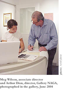
If Arthur Dion, dipping into the various paint pots around town with his curatorial brush, continues to work with associate director Meg Wilson to put together such refreshing pairings as Crite and Kamiya at Gallery NAGA, he’ll eventually include all of the divergent styles practiced by visual artists in Boston. In doing so, he’ll show that there’s room for well more than a hundred flowers to bloom. After all, it isn’t a matter, as it might once have been, of one camp of creativity theory on one side (conceptual, non-representational artists keen on international influences and interested in taking inspiration from the unusual adventures of Magritte, Kandinsky, and Beuys) and one camp on the other side of the partition (conventional, figurative artists who continue to emulate Rembrandt, Manet, and Hopper). There are more than two ways to pay literal homage or give symbolic weight to a skinned cat. Still, Dion should definitely keep the partition there.