An assembly of recent works by five local and regional printmakers has opened at the Soprafina Gallery in Boston’s South End. The five artists exhibiting—Peggy Badenhausen, Nona Hershey, D.C. Kelley, Catherine Kernan, and Lori Warner—comprise an eclectic grab bag of printing styles and techniques. The exhibit, Prints Show, will be on view through March 31st.
Soprafina offers a comfortable, non-committal, and generally anonymous exhibition space. The energy of Friday night’s exhibit gala filled the room with a warm buzz and the intimate space felt somehow significant; everyone seemed to know about the same something, even though no one could tell you what it was. Conventionally, the framed works are grouped by artist and arranged like wallflowers along the perimeter of the room, waiting for a curious (and hopefully handsome) young admirer to wander by.

While the works of individual artists are able to compel viewers, the exhibition makes no synergistic impression upon its audience. These artists have been brought together for all the wrong reasons—they all work under the inescapably broad umbrella of printmaking, keep happenstance residences in New England, and are relatively unknown outside of local art communities or printmaking circles. This is where their common ground ends.
Each artist works with distinct deference to a balance between articulating their subjects and emphasizing their techniques, and they run the gamut from geometric abstraction to direct figuration. No particular movement or politics unifies the individuals, and no aesthetic project or stance ties their works together. This exhibit is a poorly conceived curatorial effort attempting to highjack attention from the concurrent Boston Printmakers biennial exhibition 60 Years of North American Prints for the mere purpose of selling art.
Despite this, several prints transcend the slag exhibition with marked confidence and a fresh candor.
Nona Hershey—who has been teaching at and directing MassArt’s printmaking department since ’93—is the show’s local celebrity, and her black and white depictions of cloudy skies deliver expected contentedness. The six serene, tranquil works on view at Soprafina are graphite powder monotypes that foremost capture the ephemeral essence of passing clouds. Hershey proclaims, “I want to feel life—not shapes and lines and objects—wind. I don’t know if I’ve gotten there yet, but I’m getting closer,” and indeed these works do breathe through their veiled surfaces, and one senses that they might at any moment blow away.
Her prints are by traditional standards the most beautiful in the exhibition and they subtly reveal the strength of Hershey’s technical mastery. Disappointingly, however, the works meaningfully constitute little more than a satisfying indulgence or, at best, the latest (and greatest) articulation of a visual project that aims to substitute amateur Zen for analytic thinking. I can pay these works no greater compliment than they make me nostalgic for my childhood, laying on my back in the grass and staring up at the clouds, looking for the meaning that only I could put there.
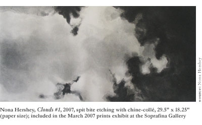
Notwithstanding, Clouds No. 3 juts startlingly from its companion pieces as the only legitimately interesting work of Hershey’s hung at Soprafina. While its basic spirit is essentially identical to its compatriots—it is another less-than-ironic etching of clouds—the thin bands of paper chine-collé printed on top of the cloudscape feel like the victorious coup de grace of Hershey’s private revolution. All at once the overcast monotony of so many cloud prints fades against the cirrus tendrils dancing through the front of your attention, lifting Hershey’s works from accomplished kitsch to vibrant originality (originality that, at least obliquely, owes a great deal to David Salle artworks like We’ll Shake the Bag). This simple addition turns a pretty picture into a serious painting that interrogates the process of its own making, the role of layering in printmaking, and flatness and illusionary space, as well as beginning to address the (much to Hershey’s dismay) inescapable questions of line and object.
A few superficial links do seem to exist among the artists but, since they rarely connect more than two projects, the intersections seem like an appreciated bonus and not a deliberate arrangement. Among the more interesting coincidental alignments: Badenhausen, Kernan, and Warner all appear to be working through the square as their principal formal problem, resisting the tradition of the rectangle and forcing (perhaps accidentally) questions of objecthood and the relationships between printmaking and other visual media.
The square is not articulated in art without precedent. Post-painterly abstractionists like Jasper Johns and minimalists such as Donald Judd and Robert Morris took on the square, representing and destroying it in countless artworks, unraveling its visual and aesthetic power. One of their ultimate conclusions observed that a square form turned the canvas-as-window treatment of landscape- or portrait-style rectangles into the canvas-as-object.
Excerpted from a longer series of recent numbered works all entitled Lyric Fragments, Catherine Kernan’s artworks are more interesting for her technique (the fragments part) than their ostensible content (the lyric bit). Kernan’s clumsy images are unapologetically and (even worse) unintentionally thoughtless. Her representational painting is juvenile at best and stirs neither emotions nor thoughts. The dilapidated prints mounted on her wooden squares would make a stronger statement if they were solid black fields (or better yet, Campbell’s Soup cans), allowing the truly (albeit accidentally) insightful elements of her work to reach the viewer.
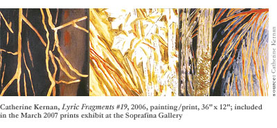
Unintentionally, Kernan has taken a logical next-step from the minimalists’ deconstructions of the shape by treating “The square as neutral—a stable and dynamic unit form.” In most of her art not presently on view at Soprafina, she uses the square as her aesthetic atom, building large and complex geometric polygons from the same tiles found in her Lyric Fragments. Her arrangements of wooden squares could intelligently position printmaking with respect to sculpture—a bold move that would be exciting if it seemed more deliberate—allowing what are now simply framing devices to become themselves the vessels of tangible, exhilarating meaning.
Countless relationships could be explored between the visual and structural dynamics of such an artwork and ubiquitous elements of contemporary life (to say nothing of printmaking practices) ranging from pixels on computer screens to Benday dots to data organization to type setting and far, far beyond. If Kernan realized the kinds of meaning her art is on the brink of communicating and abandoned faux-sentimentalist, pseudo-impressionistic landscapes from Bambi, she could become a genuinely interesting artist.
If Badenhausen and Warner’s squares are more interesting than Kernan’s, it’s only because these artists have somehow managed to produce works that are at once much better and far worse.
Peggy Badenhausen makes playful and lighthearted prints that juxtapose Jackson Pollock-esque dripped figures with hard-edged, industrial images (i.e. plumbing gaskets). The hat-tip to Pollock is one of the most interesting features of her work, since it immediately inspires an image of the artist bent over his floor-stretched canvas, guiding the quick flow of paint from a few feet above. This image then evaporates with cat-like charm as soon as you realize that you are inspecting a print, the deliberate imprint of a carved etching or cut plate.
Badenhausen’s artworks are very painterly (especially for prints) and her monoprint technique imbues every surface with a warm feeling of authenticity and uniqueness. The prints feel light to look at or walk past and the figures float loosely on top of one another, revealing layers of subtly printed images that vanish into the feathery paper ground. Regardless, these prints are the most collectively boring works in the entire show, distinguishing themselves only by their ability to remain completely unremarkable over the course of six iterations.
Lori Warner employs a unique technique of slicing and reweaving her works together along a semi-regular geometric pattern, pronouncing an active awareness of the unique relationship prints share with their host media. The process of printmaking is very much about doing things to a medium—traditionally cutting up one thing to stain another, though more recently the context of printmaking has expanded voraciously—and Warner’s works offer an interesting and progressive development in the material course of printmaking practices.
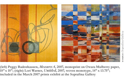
Like Kernan, Warner makes images that are far less moving or interesting than the formal implications of their creation. Further, her process goes so far as to physically modify the original imprint in ways that are arresting and satisfying. (Kernan, by contrast, only manipulates the physical structure of her works beyond the level of the square unit.)
Layering and three-dimensionality challenge visual (as well as physical) flatness in Lori Warner’s works, and while she strays beyond the bounds of traditional beauty, she stands alongside Donald Kelley as an arbiter of a startlingly powerful primal beauty that is vivacious and sincere, intimating violence and raw force. Looking at a Warner print, I feel that I might be inspecting a frozen moment while a digital camera focuses on some mysterious, pixilated scene. My mind fights to restore order. The inner patterns created by the weave also loosely echo the framing square, gesturing towards a visual order that—like a fractal—reveals the larger structure on every level of its existence.
Warner’s weave technique also situates her art along the tradition of feminist artists, making a claim on textiles like Judy Chicago did on cooking and housework that simultaneously asserts the practice’s inherent femininity while using it in an assertive and masculine mode, outside the domestic context. Again like Catherine Kernan and her accidental alignment with sculpture, Warner’s subconscious feminism seems thoroughly unintentional, but would likely yield far more rewarding artworks if deliberately explored and cultivated.
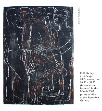
Donald Kelley—who should always go by D.C.—is overwhelmingly the most charismatic and interesting artist hanging in this exhibition. Each of his pieces is moving, beautiful, stimulating, and necessary. I look at his works and they convince me that I’ve discovered something new and exciting in the least likely of all places—on the prints of the oldest and least renowned artist in the exhibit.
D.C. Kelley’s collection of etchings and woodcuts stretch and tear expert articulations of primitive figures across the paper. His black and white palette operates, in a sense, beyond color—it appeals to the natural sensibility of stone carvings or cave paintings, precluding self-aware aesthetic judgments like surrealist pictographs. The prints are a visual pastiche of fused line drawings and wide-opening swatches of ink and paper that unify the figures and their ground into a single image.
Two of the lighter etchings in particular—Four and Horse and Riders—feel like weathered tablets hiding thousands of years of imbedded imagery. The peripheral details draw your eyes back and forth across the paper as arms crawl out of cracks and legs wind into erosion along the lines of the flecked stone. His artworks are monuments to the eternal, and he creates in the tradition of epic abstract expressionists Adolph Gottlieb and Barnett Newman. Kelley is a rare article among modern artists, striving for a new plasticity and creating prints that gesture towards the fundamental human truths of tragedy, ecstasy, and doom.
Lips, a piece in Soprafina’s current inventory hidden in a back corner behind the hanging exhibition, is an example of the other arm of Kelley’s finest work, the rest of which he’s left at home. The mixed media series of the same name—so called for the highly abstracted motif explored throughout almost all of his art-making—dovetails well with his etchings as works that present ephemeral depth in lieu of sublime solidity. These works—”really just pastel and print and mixed media works” as he describes them—drip with a just-finished-ness that situates them somewhere between Rauschenberg’s combine painting Bed and Jacques de la Villeglé’s lacerated poster décollages.
The finished works scattered around Kelley’s studio enjoy the additional benefit of being hung without a frame, which gives you a more intimate and tangible experience while the detail and nuance found in the layering, color, and texture overwhelm your senses and absorb you into a living, breathing artwork.
Kelley’s raw virility feels suffocated under glass, and he would do better to show all of his works as he displays them around his studio —hung from oversized, black paperclips. The roughly textured materials, deeply inscribed prints, and torn edge borders give the pieces a presence that suggests that they belong to a place beyond the society of art—the remnants of a forgotten journey, or the recovered artifacts of a lost world.
While Kelley suggests that framing these artworks is strictly practical—he understands the temptation that his densely tactile works exert on viewers—it prompts one of the most stirring critical observations about printmaking in the entire exhibit. Standing before a print, you see your own reflection and that of the gallery and other visitors behind you, alluding to the layered printmaking process and integrating the viewer’s experience into the work’s visual and meaningful content.
D.C. Kelley shares Nona Hershey’s earnest desire to create artworks that express something genuine about existence, explaining “I’m just trying to get some life onto a piece of paper.” While Hershey tackles their lofty project by creating prints that evoke the sensory experience of an archetypal moment or experience (such as looking at the sky), Kelley imbeds his slivers of life in an appeal to our collective unconscious.
Employing a symbolic language that functions below the level of language, Kelley’s prints communicate pan-humanistic ideas of chaos, domination, and companionship. The details reveal skill and aesthetic refinement—especially in the rough and difficult medium of woodcutting—but the holistic aesthetic of each piece leaves an overpowering impression that the works autonomously created themselves, or simply came into being. Conceptually, these are closer to artifacts than artworks—artifacts of the unknowable.