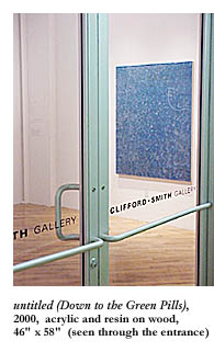
 Before you stop reading the March issue of ArtsEditor and go off-line, beam yourself up to the Web site CliffordSmithGallery.com and see if the first image from the February show of seven works by Jason Young doesn’t make you feel like you’re underwater. That’s where I thought I was when I saw those gold bubbles afloat on that deep blue background. Hence my self-satisfied glee, not long after, on reading Young quoted in an earlier review as saying that working with the toxic epoxy resins in which he floats his aqueous acrylic pigments is more like scuba-diving than painting. Apparently he feels like he’s underwater too.
Click further along in the Clifford • Smith Gallery’s Web site for other highlights of this glossy, unabashedly gorgeous exhibition and see if you don’t find yourself comparing the abstract images to other natural forms as well. One picture might make you think you’re getting a close-up of one of those bubbles just after it’s burst and has splattered on the glass mask of your Lloyd Bridges Seahunt suit. One might look like amoebae more beautiful than anything seen through a biology-lab microscope. Another may put you in mind of the pattern you’d see on leaning over the shady side of a canoe near the shore of a pond on a summer day (this may be stretching it) and staring at the overlapping lily pads until you fall into an hallucinatory state and lose your depth perception.
If you fall overboard and down into the depths that the first painting took you to, it won’t be your own reflection you’re falling into, though. There are no narcissistic mirror images to sneak looks at in these “organic forms plasticized,” as the site’s promotional material puts it. It will be an illusion you’re falling happily into. An artificial imitation of natural beauty.
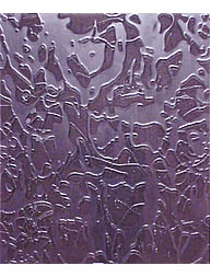
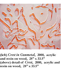
Click down that Web page, I say, to the swirling vortex of putty-colored speckles that promises to pull you into the upper left-hand corner of the illusion if you manage to lose yourself to aesthetic beauty for a change and can surrender yourself to the delicious pale green background. Then down still farther for a look at Crest and Crest in Gunmetal, two mysteriously titled, meticulously dripped, and very prettily pigmented paintings. These stunning pieces have the kind of orderly disorder you’re used to seeing in Jackson Pollack paintings. They aren’t as busy as Pollack’s action paintings. But like Pollack’s they use a bold, monochromatic undercoat over which the dripping and droozling high-gloss paint has formed a somehow symmetrical pattern, a pattern not disproportionately tipped and lopsided this way or that but weighted on the surface with such naturally democratic care that your eyes and inner ear maintain their own balance. You’re granted the serenity to float in defiance of tedium and gravity at the sight of such beauty.
At my color-screened laptop in the living room, I was reminded, looking at Young’s work on the Clifford • Smith Gallery’s Web site, of that time in the early ’70s when I temporarily lost my depth perception and for a short time saw the world the way babies do, according to the Piagetian child psychologist I was taking a course from at the time: on one flat plane, with nothing nearer or farther away than anything else. I was resting under a tree—a hemlock, I believe, a coniferous evergreen with feathery, short, dark green needles twigging with permutational complexity off the branches—and under the influence of physical fatigue and marijuana, I saw with discomforting clarity the interlocking pattern, frightening and gorgeous, of needles against the fathomless hot blue sky. Eternity turning into decorative wallpaper.
I looked down at the Web site—and remembered the more recent time, one night in the woods in Maine, when I held a flashlight up very close to a beech tree and looked in amazement at the minute detail of the smooth bark that during the day looks as soft and gray (and as saggy and wrinkled around the boles and limb-joints) as a happy young elephant trumpeting for her mother. I realized (observed is more like it) that the plain gray bark which boastful lovers scratch their initials into really consists of adjacent, vertical, rectangular pixels of color—reds, greens and blacks, if I’m not mistaken; purples, limes, and charcoals, if I recall correctly.
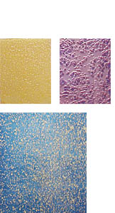

Some of the most haunting and suggestive abstract visual art appears like that—by accident. You see it in broken sidewalk cement, especially if there’s a puddle in a dip (frozen in winter, with patterns in the ice as well) or if some dandelion or chamomile is growing in a crack. You see it after a building’s been torn down up there on the wall of the building next door, in the shapes of stairways, doors, and windows, say, and in the juxtaposed strata of building materials: a row of gray cement block topped by an entire wall of red brick and framed by old brown wood. You see it in the parallel vertical shadows of lightpoles and ailanthus trees on a huge tarp protecting a construction site at night. And you see it here in the deliberate yet random patterns of acrylic paint caught in clear resin.
If you can regain your depth perception long enough to find your footing on the floor, try standing up now. The interconnected drips of Crest and Crest in Gunmetal look solid and thick enough—you can pretend you’re walking on the almost but not quite accidentally stunning pattern they make. Watching your step and proceeding one careful foot at a time, you can make your way across either picture—whichever colors turn you on most, the golds of Crest or the blues of Crest in Gunmetal—without falling through to the fathomless depths. Then keep going. Float on past the edge of the picture’s plane. Out the door for the walk to the train or the car. The vehicle you’ll glide in ghostlike toward the gallery itself. Or just spread your wings and fly there.
Clifford • Smith Gallery is on the Chinatown side of the South End, in a converted warehouse building next door to the Pine Street Inn, just a block inland from the Southeast Expressway, where the freight trains used to stop. The building, identified by a “Galleries at Thayer” banner, houses the Bernard Toale, the Kingston, and the Genovese-Sullivan, as well as the design, architecture, painting, photography, and candle-making studios of many individual artists. It’s sparse, clean, quiet, and spacious, affording the kind of meditative looks you want to give this work.
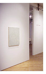
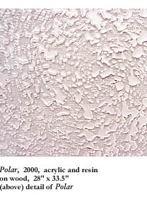
Once you do find the gallery on the third floor, the first thing you see on stepping through the door is the swirling green spiral of speckles titled Polar. It pulls you toward it but not quite into it. You stand at a safe distance regarding the celestial beauty of the piece. It’s not lily pads you see in this one—it’s stars in a self-propelled, spinning cyclone of a galaxy. Looking very closely, you notice something essential that was easy to miss in the image on the computer screen, something that will turn out to be true for each of the seven pieces, rendering unto each piece, both literally and figuratively, another level—a literal level of pigment and a figurative level of suggestion. The clear resin in which the acrylic speckles have been trapped is at least half an inch thick. More importantly, on the surface of the glasslike plate or sheet of resin float the pale, transparent shapes—pigment so thin it’s blanched, perhaps. And even more importantly, since this is where the suggestiveness comes in, this surface level of transparent pallor is shadowed by an underlapping opaque image of identical shape but of contrastingly deeper color. In Polar, that translates to putty-colored transparent surface on top of pale green opacity against a background that turns out to be different and more complex from what you might have suspected in a glance at the Web site images. There are ridges or corrugations in the green wood. It’s not a simple paint job on a surface devoid of brush-marks. There’s a lot to look at up close and to run the fingers of your eyes along, since you can’t reach through the solid acrylic like you want to with your literal fingers and feel it. There’s texture to it that piques the curiosity and arouses a mysterious hunger. You want to get your fill, the way you do outdoors, entranced by a natural scene. (All scenes, I suppose, are natural, though.)
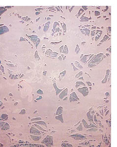
With that reassuring revelation in mind—that there’s more to this work than the beauty that met the World Wide Webbed eye—you grow increasingly aware of the infinite variations of color and shape that Young could explore, and increasingly impressed that no matter what choices he makes—of contrasting colors in background and foreground, or of gestural shape of drip, ribbon, blob, or speckle shapes—it will turn out very prettily. Here’s a delicious small piece, for instance, that offers smokey pink drips on dusky lilac background; here, a nice big one that sets pale green transparent ribbon and blob over shadowing gold opaque ribbon and blob over rich blue netting of some sort through which the even darker blue background appears. Here’s a more monochromatic blue piece in the corner: a pale blue transparent surface of drips, slightly darker blue underlapping shadow shapes, and midnight blue undercoat with horizontal wave-pattern of corrugations. (“Oh!” you say, “I saw that on the Web site! That’s unmistakably Crest in Gunmetal.”) To say nothing of that one over there—the large piece against the farthest wall, so dominated by the transparent, pale-pink surface that it looks like shapes have been cut from the transparent acrylic cover to reveal the richer pink color beneath—the last one you look at before you go back to Polar and start over again.
