“White Whale on Stilts Terrorizes Cambridge!” All right, so that is not a real headline from a 1964 edition of The Harvard Crimson, but according to architectural historian Francesco Passanti, such a phrase did enter the mind of at least one Harvard University academic when he heard that the Swiss uber-architect Le Corbusier had been commissioned to design the university’s new department of visual arts—the fortieth anniversary of whose completion Passanti’s lecture, given earlier this year, was staged to mark.

Looking back, it is hard to believe that decision could ever have been taken. Le Corbusier (born Charles-Edouard Jeanneret in 1887), after all, is the architect the public loves to hate, the alleged inspiration behind the vast, soulless concrete jungles that grew up all over Europe from the rubble of the Second World War—the jungles soon overgrown with graffiti and broken glass, riddled with crime and drugs, and suffused by the ever-present scent of urine and smoldering cars. Furthermore, Le Corbusier was the man who, four decades earlier, had drawn up serious proposals to demolish the historical centre of Paris and replace it with a rectilinear grid of tall tower blocks, broad highways, and dark underpasses. Surely the Harvard authorities would have been anxious to keep such a brazen iconoclast as far from their treasured Yard as possible. Then again, this was the early ’60s, and the machine-influenced “International Style” of architecture, of which Le Corbusier was the most famous proponent, was still associated with all the optimism of the brave new industrialized world—liberation from drudgery, universal welfare, the thrill of speed and technology. Even stuffy old Harvard wanted a piece of that. Even stuffy old Harvard wanted its own white whale on stilts.
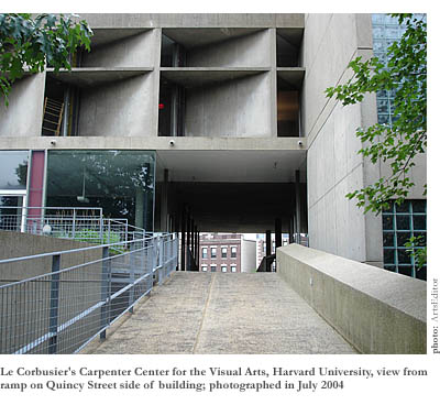
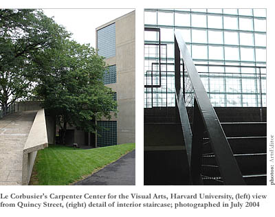
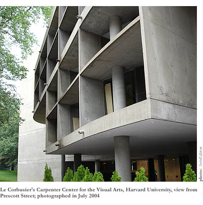
I still have a vivid recollection of the first time I saw Quincy Street’s Carpenter Center (at which time I knew it only as the home of the Harvard Film Archive). It was dusk: still light enough to clearly make out its complex combination of sinuous curves and rigid right angles, its ultra-modernist arcade of columns and beams protruding from the top floor in celebration of structure, the iconic ramp that leads up from the sidewalk, where it disappears into a dark hole punched through the building. But it was also dark enough to witness the dramatic effect of the interior lighting shining out of the plate glass of the first floor exhibition space, the copious glass bricks of the boldly rectilinear stairwell, and the apparently randomly spaced strips of window in the peculiar “grand piano” form that projects out of the second floor, supported—of course—by stilts (or “pilotis,” to give them their technical name). I was wonderstruck. Here, I thought, was a truly rare thing: a realized building that looks as gloriously pure and sculptural as an architect’s model—a true work of art, the finest building in Boston. Nor, apparently, am I the only person to have experienced such a reaction; as Passanti reports, even the academic who made the “white whale” comment also admitted, once he saw it, that the Carpenter Center was a beautiful building.
However, my wife, who was with me, complained that it was too stark—especially when she saw it again in daylight. Couldn’t it at least have been faced with Modernism’s trademark white stucco, instead of being left in the drab, natural gray of reinforced concrete? Mounting my high horse, I told her she was a philistine, incapable, like so many untrained eyes, of seeing beyond the popular prejudice against concrete. Besides, couldn’t she see the impression, grain and all, of the thin wooden slats used to cast the irregular piano? What better ornamentation could there be than that?

However, having listened to Passanti’s lecture—Le Corbusier’s Carpenter Center: the Building and the Architect—about how the building came to be, I find myself in the all-too-common position of having to admit that she may have had a point, at least in the sense that Le Corbusier might have agreed with her. (Whether he did or not we cannot know, since he died in 1965, before seeing the building completed.) For it turns out that the architect’s original design—before financial reality intervened—called for a much more embellished building. Both outside and in it was supposed to be decorated with specially commissioned sculptures, murals, and a kind of modern-day fresco called “sgraffito,” which involved etching designs into the concrete walls while they were setting. Most of the interior walls were supposed to be painted in exuberant colors, and the floors were intended to be covered with black and white tiling. Meanwhile, the copious flat roof space that results from every floor having a different plan (a typically modernist motif enabled by the fact that the weight of the structure is born not by the walls but by the concrete frame) was supposed to be covered with undulating hills of earth and planted with shrubs.
Part of the rationale for some of these elements, Passanti explained, was Le Corbusier’s interest in creating a fusion of the arts. The murals, for example, represent a fusion of painting and architecture, while the spacing of the piano windows turns out to be based on experimental musical interludes—the source of which, by the composer Xenakis, was possibly supposed to be piped into the lobby via a system of speakers. Some academics also speculate that the windows of the painting studios are supposed to represent a film strip, the frames of which unfold as the observer walks along the ramp.
Francesco Passanti’s lecture also shed light on the rationale for that ramp. For all my admiration of its dramatic, curvaceous form, I was always a little perplexed by the fact that it invites one along it, only to deposit one in an unremarkable backstreet—Prescott Street—which, at best, might make a good parking place when visiting the Film Archive. It turns out that the whole block on the other side of Prescott Street was supposed to be acquired by Harvard University for a second campus. Hence, the ramp, originally supposed to go right over the top of the building, was conceived of as a ceremonial bridge—a “route touristique”—between the new campus and the old. This would have been especially appropriate at a time when Harvard was trying to place learning through the eye, as opposed to merely through the book, at the center of campus life. (The American Repertory Theatre was built at the same time for the performing arts.) It also explains why the Prescott Street façade of the Carpenter Center is almost as dramatic as its Quincy Street cousin, with its two-story grand piano (the top story bigger than the lower), and its matrix of angled windows which open up, like waking eyes, when viewed from a little way down the street.

These windows—”brise soleils” or “sun breakers”—are designed to avoid direct sunlight penetrating the building, so that the artists inside don’t have to deal with glare. Indeed, although famous architects are often accused of putting their egos before the needs of their clients, such attention to the students’ needs is actually very much in evidence in Le Corbusier’s design, as was revealed to me during a tour of the building conducted by architecture student Brian Goldstein. (Brian also co-curated, with student Michelle Kuo, the interesting exhibition of artworks, photos, films, models, and construction drawings that Passanti’s lecture inaugurated – VAC BOS: The Carpenter Center and Le Corbusier’s Synthesis of the Arts.) The strangely-shaped interior spaces work very well as painting studios and, where the light is a little dim, the architect has usually managed to insert a brightly-painted skylight (again, made possible by the varying floor plans).
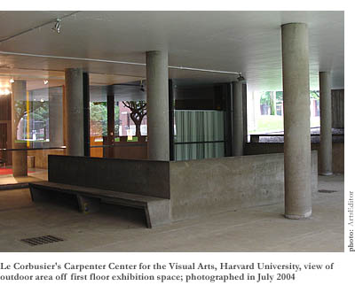
Even a potential architectural flaw—the awkward area created beneath the ramp where it cuts through the building—becomes a virtue, since the students of the Department of Visual & Environmental Studies use it both to store their sculptures and to carry out processes such as spray painting, which needs a lot of ventilation. Indeed, despite its pedigree as the only realized building in North America by one of the most important architects of the 20th Century, the Carpenter Center—unlike, say, the Lincoln, Massachusetts house of fellow Modernist superstar Walter Gropius—is in no way treated as a museum. On the contrary, one gets the impression, walking around, of a building in very active use. Its floor is speckled with paint, its pilotis are chipped and stained, and various chainsaws lie around ominously—a sight to delight an architect and horrify an architectural historian.
Critics often complain that the building is overly complicated and hard to comprehend. Passanti, for instance, raised a rare laugh by noting the Freudian slip he committed while writing the text of his lecture—intending to write how flattered he was to be invited to talk about the building, he instead wrote that he was flattened. And it is certainly true that for all the apparent rationalism of its design process, guided by Le Corbusier’s trademark modular system, based on a six-foot grid (six feet being the height of some abstract “everyman,” to whom he wanted his buildings to be proportionate), the building is rather whimsical. One obvious example is the way the ramp is flanked by an apparently random series of concrete parapets and iron railings. Another is the peculiar 45-degree orientation of the building on the site. However, I see such peculiarities not as flaws so much as strengths. One of the charms of old buildings, for example, is all the strange, unexpected little nooks and crannies they contain. Perhaps the exploration of such essentially irrational spaces is a rather childish pleasure, beneath the dignity of an architectural critic reared on unifying concepts, but if buildings—even modernist ones—are to be humane, as Le Corbusier passionately desired, surely they ought to be permitted a few ad hominem attractions.

Nevertheless, there are criticisms of the building I could make. One is that the entrance to the Film Archive—the narrow set of unremarkable stairs that leads down from the lobby into a basement corridor—is disappointingly mundane, distinctly uninviting, and frequently overcrowded. Another is that the one place where the architect’s desire for shrubs was realized—outside the second floor Sert Gallery café—has been allowed to degrade into a tangle of dead twigs and weeds. Surely it wouldn’t be too much to ask for someone to drive over to Home Depot and buy a new petunia or two, to adorn what is otherwise a great spot to enjoy a coffee on a sunny day.
It is also a shame that the use of the first floor lobby as an exhibition space renders the adjacent outdoor area, complete with concrete tables and chairs, something of a white elephant (as opposed to whale). On the other hand, the huge, square, centrally hinged metal door intended to give access to it has apparently become so warped by Boston’s extremes of temperature that opening it is almost impossible. Besides, as we all know, the stifling heat of a Boston August is more than can be rendered tolerable simply by the shade of a giant concrete grand piano.
To be fair, Le Corbusier, who spent most of his life in France, had no experience of the New England climate. That fact also at least partly excuses the hopeless inadequacy of the cooling system he devised for the building, consisting of a series of thin, vertical openings called “aerateurs,” via which a refreshing breeze is supposed to filter through the interior. Luckily, the studios are virtually deserted in summer anyway. Admittedly, the pair of blissed-out lovers we encountered in the small, secluded fifth floor pavilion (originally intended to be the studio of a resident artist) appeared to be something of a permanent installation, sprawled on a tattered red sofa amidst a forest of unattended easels. But, then, listening to The Doors at full volume on their paint-splattered boom box, they were emitting more than enough cool to air condition the whole building.
