Nearly an anachronism in today’s automated world, a “mixtape” is a handmade compilation of songs by different artists, configured in a deliberate way to convey one’s affection for both the selected music and the intended recipient, often a friend or lover. An enduringly popular American art form, mixtapes began on analogue cassette tapes, then evolved onto compact discs, which in turn were absorbed by MP3s and digital playlists. A group exhibition in an art gallery is something like a visual parallel to the mixtape. The gallerist handpicks what he or she believes to be the most salient, relevant work from a diverse group of artists, and sequences it in a space with an audience in mind.

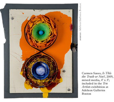
Adelson Galleries Boston is keeping the art of the compilation alive in a new exhibition simply titled Ten Artists, on view through June 30th. The mixtape analogy works on two levels here, in both the diverse media and range of practices, but also in the idea of craft in handmade art. This eclectic exhibition explores the range of modes and media prevalent in contemporary art practices. Several of the pieces were made with mixed media themselves. Carmen Sasso’s Is This the Truth or Not? (2009), for example, is an abstract assemblage—part painting, part sculpture. Evoking a kind of stereophonic synesthesia with its speaker-like cones, the artwork blasts two loud colorful forms out at the viewer. Or perhaps it’s more like the nucleus of an atom, pulsating with compressed energy. A black strand of foam twists around the two circles, creating an infinity symbol. This artist keeps a Jungian-based dream journal, and develops his ideas for artwork from his associations and intuition.
Sasso’s two pieces in the exhibit neatly frame an equally intense work by Ian Hughes. Boot Stack (2013) is a vibrantly chromatic painting that suggests the organic forms of the Merry Pranksters during their “acid tests” in the 1960s, produced by pouring colored ink onto light projectors. In Hughes’ piece, translucent washes of luminous colors mix and swirl into one another in a chaotic fashion atop a solid opaque ground, creating a compelling composition in this psychedelic abstraction.
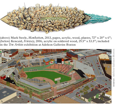
Somewhat less “far-out” than Sasso’s dream-based art and Hughes’ acid-flashback art is the folksy Americana of Kencaid, known locally as “the paperclip artist,” who patiently applies daubs of acrylic paint onto soldered wood panels with said tool to compose familiar views of Boston. This peculiar and meticulous process generates few works per year, but the results produce an engrossing level of detail. These charming, childlike compositions are reminiscent of the landscapes in the Where’s Waldo? books, albeit without Waldo.

The apparent disparity between Kencaid’s work and that of Hughes and Sasso might seem alarming to some viewers. But this is the essence of an anthology—to present a representative sampling of divergent works in a single format. Gallery director Adam Adelson, along with his sister Alexa, whose family’s history of art dealing in Boston goes back to the 1960s, have selected these artworks from the hundreds of local artists who have introduced themselves since the gallery opened last autumn. They explain: “As Adelson Galleries has begun to settle into a new home in Boston, we have decided to celebrate some of the local artists… this is just a small sampling, but some of the best we have seen.” As incongruous as it may seem at times, the wide range of styles, from illustrative precision to gestural abstraction, means there’s a little bit of everything, and something is sure to catch each viewer’s eye during this exhibit.
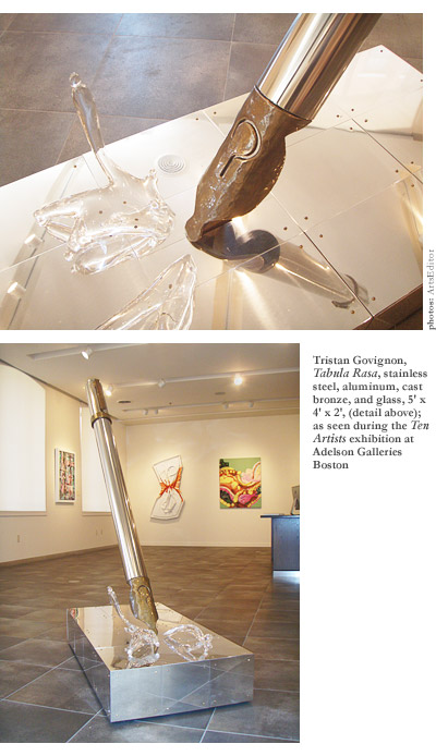
One piece literally stands out. While most of the exhibition is two-dimensional work hung on the wall, there is one true three-dimensional piece. (Several works are sculptural reliefs.) Within a few steps of entering the gallery, visitors are confronted with a larger-than-life metallic fountain pen, surprisingly upright, as if being used by a giant invisible hand. Tristan Govignon’s Tabula Rasa (2012) is effectively the centerpiece of the exhibit. The giant Pop Art pen, a reminder of Claes Oldenburg’s ironic monuments to everyday objects, punctuates the space as the physical manifestation of the creative act. The vent hole of the pen’s nib appears as a negative-space question mark, implying the mystery of art. This is answered by the exclamation point of the pen’s body. In other words, Tabula Rasa both asks and answers itself through its very form—every act of creation a question, every work of art an answer.

Govignon explains that this piece was partially a response to Carl Andre’s Equivalent VIII (1966), sometimes referred to as “The Bricks,” essentially a rather dull grid of beige bricks arranged in a rectangle across the gallery floor. He feels that Minimalism like Andre’s is not really art until somebody accidentally drops an ice cream cone on it or something. Of course, to a certain extent Andre might agree, seeing as what Minimalists of his generation were attempting to achieve was a context-based “anti-art” or “anti-aesthetic.” The base of Tabula Rasa is a shiny metallic grid, pierced by the point of the pen, which is a hypothetical ice cream cone—it represents the “something-ness” against the nothingness of the grid.
Govignon, who works in a variety of media, actually has three pieces in this exhibit, the other two being the oil paintings Audubon Park (2006) and Dawn (2009). The former sold to a buyer last week and remains on view. The latter hints at the work of postwar German painter Gerhard Richter. When asked about this connection, Govignon acknowledged the resemblance, but insisted he arrived at this aesthetically pleasing technique independently. While the basic approach of “squeegeeing” different layers of multi-colored paint across the surface of a canvas is the same, Govignon’s palette is more intense, and his application of paint more playful than Richter’s.
The exhibition has street cred too, with the hip “urban-expressionism” of Tyson Andree, better known as “Caype” to those familiar with the graffiti scene. In his diptych, A Man and His Painting (2013), he depicts through gestural marks the street artist stepping back from his work, assessing his progress. It is a fun piece, mixing a traditional painting format with the quick streaks of application associated with graffiti. Some of Andree’s artwork on paper is currently on view at the Institute of Contemporary Art Boston.

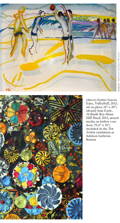
The aforementioned psychedelic theme gets picked back up in Sam Earle’s collage of animals, circles, and creepy eyes, which seem to stare at you while you scan the surface of his mixed media work. And Esther Garcia Eder’s paintings of loose figures, as seen strikingly in Volleyball (2013), exemplify a contemporary take on Henri Matisse, while Jeff Smith’s One Star (2007) combines different wood materials to create a uniquely American collage.
A Boston / New York connection is present in Ten Artists as well, reinforcing the common connection between these two great cities. Many of the artists on display here exhibit in both places. Brooklyn-based artist Jason Gluskin, depicts an impassioned musical session in his whimsical painting The Jazz Lounge (2012), and the iconic island of Manhattan is turned into a huge ship seen from above, moving across the water, in Cambridge-based artist Mark Steele’s Manhattan (2013).
American essayist Geoffrey O’Brien has called the mixtape “the most widely practiced American art form.” Like a group art exhibit, it all comes down to the editorial process. What must be in? What doesn’t make the cut? What is the absolute best work? In what order should it go? Careful selection and arrangement is of utmost importance, and the sum total ought to be greater than the individual parts. Adelson Galleries Boston has achieved this with Ten Artists, an eclectic compilation of various forms and materials, techniques and concepts that turns out to be quite playful. As with a good mixtape, it’s exciting to anticipate what comes next.
