When I visited the Institute of Contemporary Art (ICA) for the first time recently, my first impression was that the far end of Back Bay is no place for an art gallery. Cowering amidst the snarling fumes of Boylston Street and the Storrow Drive underpass, the small, neo-Romanesque building looks out onto a veritable architectural graveyard that includes a concrete multistory car park, the Hynes Convention Center, and various utterly dreary tower blocks (amongst which the much-maligned Prudential Tower is actually the least offensive). The best that can be said for the existence of an art gallery in a scene of such urban desolation is that it might serve as a haven for any human beings foolish enough to stray from Newbury Street.

It is just as well, then, that my purpose in visiting the ICA was to view the model of its proposed new premises, to be located across town amidst the aquatic calm of Fan Pier in South Boston, just over the Fort Point Channel from central Boston. (The model will be on public display at the ICA from January 22 to April 27 next year.) As the oldest museum in the country dedicated solely to contemporary art, the ICA was the unanimous choice to be invited to form the cultural centerpiece of the ambitious, $1.2 billion redevelopment of that part of town (which is currently given over to industry). The gallery authorities immediately accepted the invitation and set about scouring the globe for suitable architects to entrust with the commission for the first new Bostonian art gallery in nearly one hundred years.
After twelve months, they settled on the innovative, American-based practice of Elizabeth Diller and Ricardo Scofidio, whose involvement in visual and performing arts as well as architecture complements the ICA’s similarly interdisciplinary commitment to art in all media, including film, live performance, and new media. The design brief accordingly included provision for a theater and “media center,” as well as triple the amount of gallery space available in the ICA’s current premises (which will allow for the establishment of a permanent collection as well as the continued staging of temporary exhibitions). In addition, the architects were required to include a café, a restaurant, a bookshop, and a classroom for the ICA’s educative activities, all of which will be open to the general public.
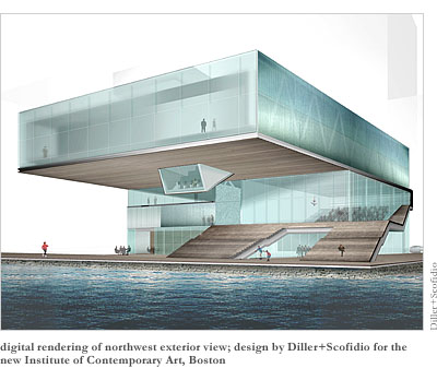
Diller+Scofidio responded by envisaging a building in two parts: a three-story lower section to house all the public areas, surmounted by an upper story containing the more contemplative spaces appropriate for a gallery. As Diller rather pretentiously puts it, “The ‘public building’ is built from the ground up; the ‘intimate’ building, from the sky down.”
The upper story constitutes the main architectural features of the building, cantilevering dramatically over the lower floors toward Boston Harbor. Other eye-catching features of the design include the huge staircase-like element, which forms the floor of the theater, slicing through the glass side-walls as it does so, before breaking out of the interior entirely to meet the public harbor walkway (whose material it will mirror), forming a “grandstand” where passers-by can sit and enjoy harbor views sheltered by the upper floor cantilever.

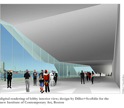
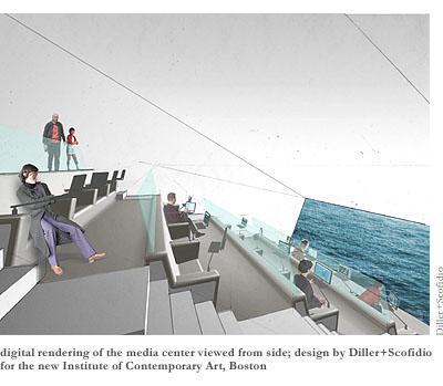
Then there is the lobby, whose dramatically sloping roof (actually the underside of the staircase) and distinct horizontal tapering funnel visitors towards the payment desk. Even more startling is the media center, which slopes roughly thirty degrees down from the cantilevered upper floor, like the headlight of an upside-down sports car. The end wall of this center will be all glass, and the angle is such that it will frame only water, without horizon or sky.
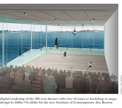
Such views of the water are a constantly recurring theme of the design. The galleries themselves will include a whole wall of “lenticular glass,” through which the harbor will be visible provided the viewer stands directly in front of it. And even the theater stage will feature an aquatic backdrop—although it will also be possible, through the miracle of technology, to make the theater glass either translucent or entirely opaque should the particular performance be deemed to require it. In fact, almost the entire building is clad in glass of some degree of transparency, such that the whole effect is rather like that of a giant Macintosh computer, the exposed, zigzagging trusses that support the upper floor cantilever reminding one distinctly of the exposed circuit-boards of the Apple corporation. And no doubt this resemblance will only be enhanced at night, when the upper floor will be illuminated to become “a radiant, welcoming waterfront presence.”
Of course, the exposed-circuit-boards effect can now be seen in everything remotely electronic, from radios and TV remotes to telephones and even cameras. Hence, one might well wonder about Diller+Scofidio’s taking inspiration from such a distinctly tired design fad. On the other hand, exposure of structure is not a new idea in architecture; beloved of the Twentieth Century International Style, the notion goes back at least as far as medieval Gothic. Still, it would not be entirely unfair to accuse Diller+Scofidio’s design of being a little gimmicky—a little too anxious to make it onto the front covers of the international architectural magazines. Take that media center, for example. Wouldn’t a view of harbor waves sparkling in the sunshine like a giant screen-saver just distract someone trying to concentrate on Internet surfing? And wouldn’t such a person be further disturbed by endless streams of the idly curious washing into that novel space from the galleries above?

Nor is this the only architectural flaw that stems from the architects’ excessive concern with making bold visual statements. Another example is the patchwork of steel and glass panels that clads the lower section of the building. These are intended to “blur the distinction between walls, windows, and doors”—all very well in a private building whose owner is in on the joke and aware of the location of the real door, but not, perhaps, so appropriate in a public building, most of whose users will be one-time visitors. Moreover, the sense of disorientation will only be added-to by the harbor-side grandstand, which invites visitors up it only to confound their expectations of access with the revelation that the door at the top only leads into the theater. The architects respond to this criticism by insisting that the connection of “ceremonial stairs” to modes of ingress is “the formula of museums from another age” and that their design consciously “inverts that outdated reading.” However, since, as they admit, that reading still exists in the minds of many critics, it seems folly not to expect the future building’s users to fall into a similar trap. Diller and Scofidio may derive a postmodern chuckle from the idea of streams of visitors walking up and down staircases unnecessarily; perhaps they even regard it as performance art—or else a scheme to make humanity fitter. But the slim, ghostly figures in their computer-generated publicity images will soon become real people, and to set out to deliberately mislead them seems distinctly architecturally unethical.
Another problem with the grandstand is that, for all its sculptural qualities, its continuation up the side of the building (outside the theater) seems rather unsatisfying since it leads precisely nowhere, eventually tapering off into nothing on the third floor. The architects’ response is to insist on the distinction between the terms “staircase” and “grandstand.” A staircase is a “passage,” leading somewhere. A grandstand, on the other hand, is merely a “gathering place.” Fair enough, one might say, but I still suspect that the narrow, awkward upper section of grandstand is most likely to be used as a way to view theater performances without paying; the best views of the harbor, unobstructed by the building, would be available lower down on the grandstand.
Nor does a huge, north-facing window-façade show much practical concern for the icy Bostonian winter, during which, as any engineer will tell you, heat escapes through glass walls as fast as it is generated (resulting in sky-high fuel bills, not to mention environmental impact). Yet perhaps it is too much to expect a young architectural partnership, embarking on its first major new building project in the US, to concern itself unduly with such mundane issues. And, after all, surely the aesthetic iniquity of gimmickry is dwarfed by the World Trade Center-sized iniquity of bland conformism.
Moreover, ever since Frank Lloyd Wright’s Guggenheim landed in New York, it has become de rigueur for any new art gallery or museum to make a bold architectural statement. From Frank Gehry’s new Guggenheim in Bilbao to the Tate Modern in London to the National Museum of Scotland in Edinburgh, the building is at least as much of an attraction as the exhibits it contains. And why not? After all, architecture is an art, too. If gallery directors don’t give architects’ imaginations free reign, who will? As the ICA’s press release declares, the new building will constitute “a progressive architectural statement that mirror’s the museum’s foresight and risk-taking as a leading contemporary art venue.”

Nor should we underestimate the boost an iconic new building can give to a city’s tourist industry. Even though the new ICA does not remotely compare, in terms of innovation or beauty, to Gehry’s or Wright’s Guggenheims, it probably has enough architectural hooks to justify at least some of Mayor Menino’s gleeful anticipation. (How ironic it is that so many of the visitors it will attract will stay in the architecturally worthless towers of the Hilton and Sheraton that overlook the ICA’s current premises!)
Nevertheless, I remain a little uneasy about “flashy” architecture in the context of an art gallery. I don’t understand ICA director Jill Medvedow’s pronouncement that the new building will “expand ways of looking at and understanding the art and architecture of our time.” It seems to me more likely to distract from the works of art on display—like an oversized, overly elaborate frame. Surely there is a lot to be said for the purity of experiencing art in a building that in no way superimposes itself on one’s consciousness of the artworks before one’s eyes.
Then again, I fear there is a great deal of contemporary art that might not stand up to such undivided scrutiny. Yes, call me a reactionary old philistine, but I quite often find the vistas from the windows of contemporary art galleries to be more interesting than the works on display. Hence, the new ICA building, with its plethora of real watercolor harbor scenes, might well have been designed with me in mind. Too bad that it will not be open until 2006. Until then, I will just have to continue braving the soulless wastes of sixties town-planning if I am to challenge my prejudices about the soulless waste of sixties oil paint.
