A barebreasted bronze figure, a statuesque woman in a wrapped skirt, greets me at the door of the Judi Rotenberg Gallery the first time I climb the classy iron Newbury Street staircase, dropping by to look at the Harold Rotenberg at 95 show. Two feet tall, she cups her hands before her, in a gesture more of giving than of receiving, and steps with her left foot forward, the eyes in her slender face closed as in a trance, spine in perfect perpendicular alignment to the floor, finely sculpted limbs and torso in graceful proportion. She’s an African village beauty on this whitest and wealthiest of big-city American streets, and she puts me oddly at ease.
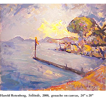
Above her in the window, at eye-level when I reach the stoop, a colorful painting of a very long pier extending far out into a crescent-beached bay greets me as well. I take in the distant view of the bay, letting the broad, crucially compositional curve of beach sweep me upshore, as if on the tide, a mile or two beyond the pier and right on out of the picture, past the horizontal meeting place of sea and sky. I turn around way up there and zoom back on the beach to get a better look at the palm trees here in the blustery foreground. At least I think they’re palm trees, fanned fronds sprouting from the very tops of the slender, towering trunks, maybe the very palms that the painterly American poet Wallace Stevens claimed could be found “at the end of the mind” with an exotic tropical bird in its crown, “fire-fangled feathers” dangling down, dust-brush crowns bobbing above the chaotic clumps of mottled buildings and bushes below. A subtle yellow reflection smears the water with sunlight. And, at the top of the tall pole at the end of the pier—a pole probably taller than the palms, right there toward the middle of the painting—a single orange brushstroke of a banner whips in the wind, warning the small aircraft not to fly too close.
The door, though, of the gallery is closed. I’m late, I guess—or else they’ve closed early. So I peer through the glass door and notice that I can study a whole wall of Harold Rotenberg’s paintings (roughly half the exhibit) from the stoop outside. It’s nice out too—a warm, late-summer evening—and there’s a certain inspired swiftness in the air. From my shoulder-bag I draw the plastic tarp I use for solo lunch-hour picnics on the grass, flinch upon seeing that it’s exactly the same color (and just as weatherbeaten) as the orange banner at the end of the pier, sit down on the indoor-outdoor carpeting of the stoop (still soaked from the morning rain), and start taking notes, stealing glances and jotting my observations until, five minutes into it, I realize that the more willing I am to write down my impressions, the more freely my impressions take form.
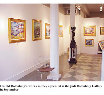
It won’t be ’til my third visit to the gallery that I actually get up close to the paintings—the door’s closed the second time I visit, too, early one weekday evening—but from some 20 feet away, through thick plate glass, I can see what Harold Rotenberg’s after, and how his daughter, proprietor of the gallery for nearly 30 years now, could justify putting up what to some could seem a nepotistic exhibit. And it won’t turn out to be true of the whole show, but every one of the paintings I can see from the stoop, on the one visible wall, is a waterscape of some sort, splashed on vigorously in gouache like the one in the window. It looks like good stuff too, of a richness, daring, intensity, and independence a few steps removed from the corny, commercial, waterscape art it might at first seem to resemble, from a palette palatable to the connoisseur of representational “plein aire” paintings created in the distant wake of the French Impressionists. The paintings I can see from here all appear to consist of natural forms worked up from scratch like the one in the window, all of them efforts at attempting, with wide, rough brushstrokes, another lusty permutation of water, boat, shore, and sky. Nearly every stroke—I will learn later when I get a closer look—asks to be measured not only for its physical dimensions (width and length and rectangular approximation) but (if only there were a meter) for its emotional content, tonal depth, and caloric heat content as well, and for its contribution to the whole “complex of emotions” Ezra Pound liked in good works of art.
I can see, in the areas where no white-hulled boat or tidal blue estuary or red-roofed fishing shack can be discerned, that the bushy tangle always consists of an unbundled arrangement of such brushstrokes, in three or four delicious colors, so that a close-up, say, of four square inches of gouached canvas may reveal nothing whatsoever about the subject of the painting. But lots about the object of it.
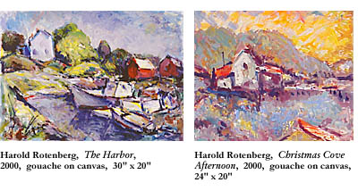
The water provides a quiet reflection of the orange-roofed white house, grayish green backdrop of a hill, and paler orange sky of Christmas Cove Afternoon. It snuggles—it more than laps—the prows of fishing boats moored in the inlet, against the background of white house and red outbuildings, in The Harbor. Flat, blue and calm, it maintains another pristine crescent beach stretching for what appears to be a few miles along the excited orange shore of Motif #1, where a few animated palms with green fronds blow in the breeze against the turbulent white and gray sky. It gathers a bunch of fishing boats and outbuildings (distinctly less discernible from the surrounding natural weather than in most of the paintings) in Abstract Maine. And it courses through a similarly cluttered cluster of human habitations, seeking and finding its own level, in Blue Motif.
Eager to get inside for a closer look, but surprised to be able to get such strong impressions from this distance, I take in each local setting, imagining the pleasure that had to have been had in crowding the frames with the busy crissings and crossings of color without losing the sense of the picture. Whether a working harbor in Maine at rest, reminiscent of the observant maritime poems of Elizabeth Bishop, or a pleasurable picture postcard setting in Cannes, one thing’s for sure: There isn’t one human or animal figure in any of these paintings. And so is one other thing: These paintings are far from complete abstraction, yet they indulge freely in the application of colors, depicting a whole hillside formed of gray, white, turquoise, and orange brushstrokes, straight and swirly strokes alike, without a single identifiable image—just insinuations of tree trunks and crowns.
On my third visit to the gallery, it’s raining and chilly, the dreary middle of an early autumn Tuesday; but the lights are on and the door is open. I get close-ups of the paintings I saw the first time—and realize how varied in color and mood they are. Then gliding back and forth along the wall I hadn’t been able to see from the stoop, I note the continuity of waterside subject matter and jot down the titles of the ones that sustain the mixed motif of water, sky, and shore—Folly Cove, Beach Cannes, and Maine Afternoon. I start to see a zig-zag compositional pattern ordering the sections and deepening the perspectives of several paintings, and notice that not every painting is a waterscape after all. Admiring the range and youthful vitality of the 95 year-old painter’s moods, I talk for a moment with his accommodating daughter, Judi, and her new assistant. And on my way out I pick up the large postcard announcing the show’s opening reception, a couple of weeks in the past now.
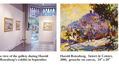
Ironically, I get my longest look of all at this painting on the postcard, Sunset in Cannes, that I’ve never seen in the flesh—the same way I’d know a piece of music better if I played it over and over on a boom-box tape player than if I heard it performed once, live and in person, by musicians on a stage. I note the easy-to-miss shadow-black tree in the upper right foreground and its complementary ground shadow in the lower right foreground, together forming a V that’s been pushed onto its side. But that’s later, really. What I notice first is the scene between the bars of the V: a colorful distant hillside, an irregular rectangle-shape that goes from oranges and yellows on the lower left, up the slope through blue and gray and black to purple on the hill’s tower-empurpled peak. In the upper left, contrasting the V of the black tree and its shadow, there’s a triangular section of yellowish orange sky. The only water in this painting seems to be the water that is so abundant in the gouache, gouache (“a method of painting with opaque water colors mixed with a preparation of gum,” says my American Heritage) being the bolder, brighter, more intense and ambitious brother, you might say, of watercolor.
Sunset in Cannes, like many of the pieces in the show, is both a geometric abstraction and a conventional landscape, and it puts me oddly at ease.